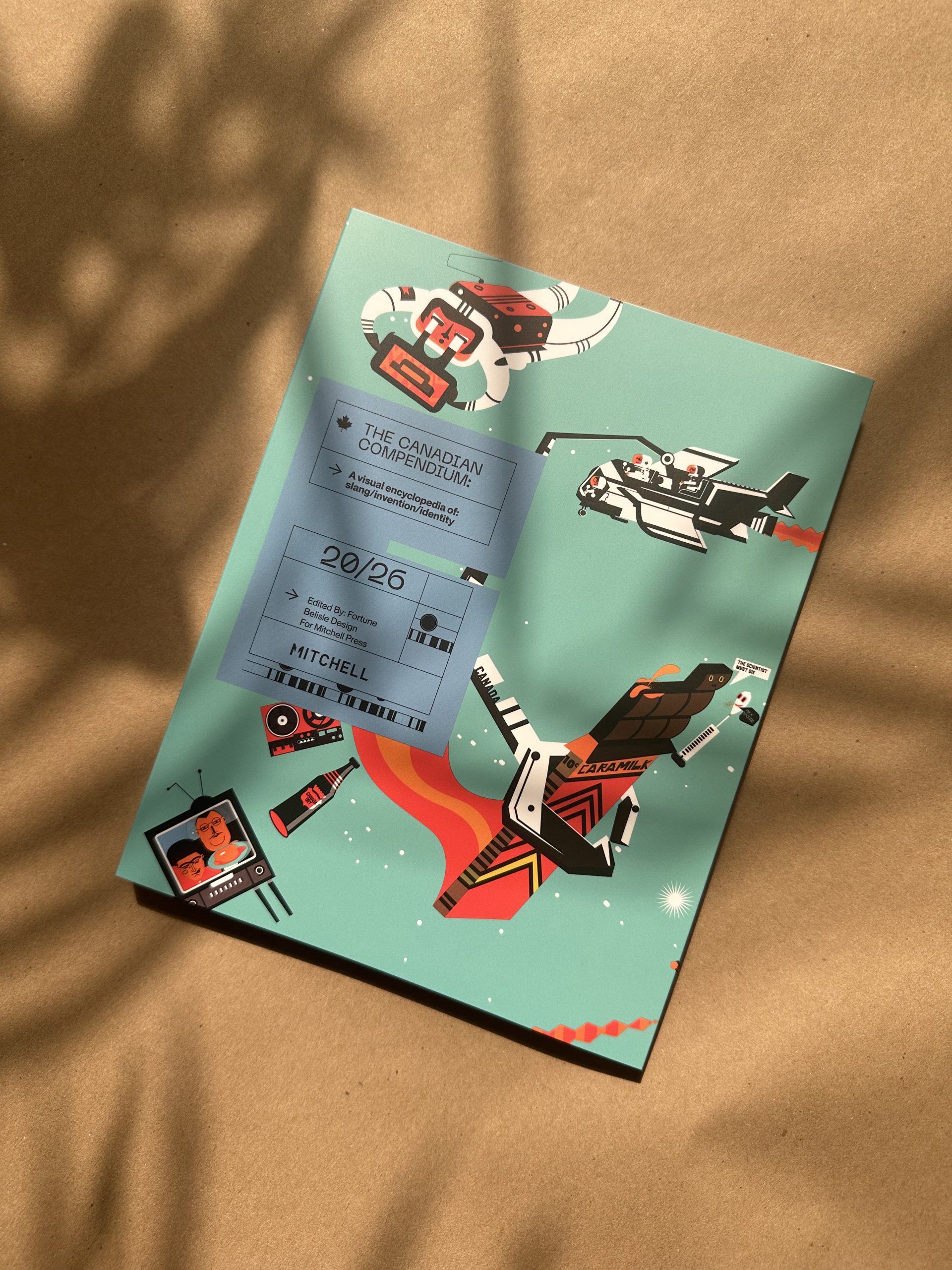
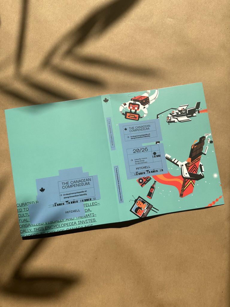
The Canadian Compendium is more than a journal—it’s a celebration of Canadian identity, storytelling, and creativity. Filled with illustrations, historical references, cultural insights, and uniquely Canadian moments, the project brought together researchers, writers, designers, illustrators, and print professionals to create something meant to be explored, used, and enjoyed.
As the project’s illustrator, John Belisle played a key role in bringing these stories to life through his distinctive visual style. We recently caught up with John to discuss his creative process, the challenges of illustrating such a wide-ranging subject, and what it’s like seeing artwork transform from concept to finished printed piece.
Here’s what he had to say:
Mitchell:
What first attracted you to The Canadian Compendium project, and what made you want to be involved?
Belisle:
My friend Dave Fortune mentioned he had been compiling a list of Canadianisms, and the Mitchell sketchbook felt like a natural fit. I love projects that are Canadian inspired and it gave us a chance to have some fun and mix in a bit of humour to the illustrations.
Mitchell:
The Canadian Compendium explores Canadian slang, inventions, history, and identity. What aspect of Canada was the most enjoyable or surprising to illustrate?
Belisle:
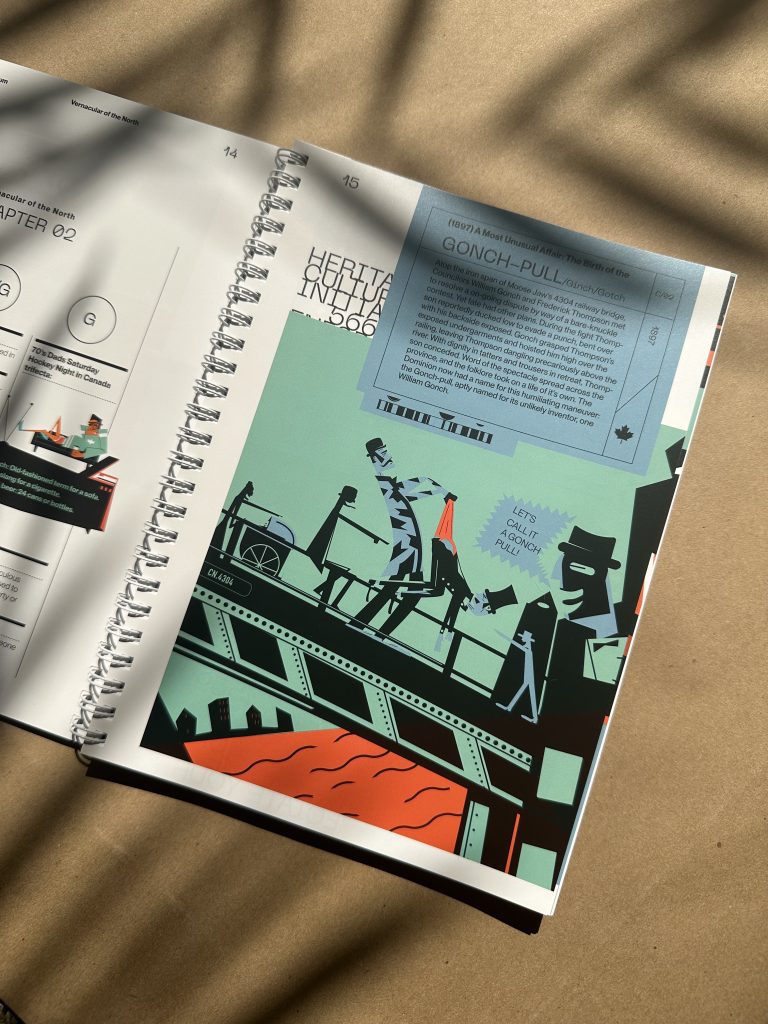
I think trying to figure out how to explain how the Gonch pull originated, and then illustrate it. It was both challenging and pretty entertaining to work on.
Mitchell:
Can you walk us through your creative process from concept to illustration?
Belisle:
I knew primarily the book was a set of lists so that drives the layout, and within that I tried to figure out how to expand the book past being page after page of definitions. From the start I also wanted the editorial style to be based on Government forms and very dry technical descriptions. Then balance that with layered illustrations and design.
Mitchell:
Was there a particular illustration entry that is your favourite, or one that presented a unique creative challenge?
Belisle:
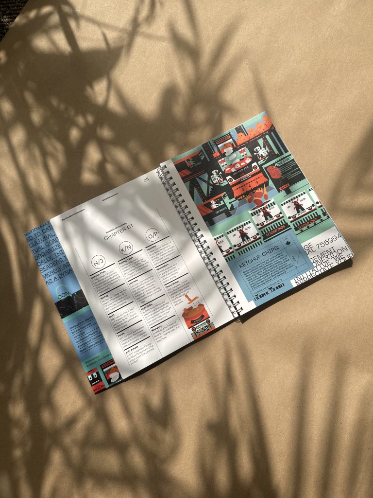
Definitely the Ketchup chip illustration. I wasn’t sure how to show the process of how chips are made but knew I wanted it to be based on how I think a kid might imagine chips are made.
Mitchell:
As an illustrator, how does your approach change when creating artwork intended for print rather than digital platforms?
Belisle:
Usually when I create print illustrations it tends to be as part of a book, so creating a brand look is always important. It also means that viewer probably is going to spend a bit more time viewing it, instead of seeing it for 3 seconds and swiping to the next post.
“Mitchell will take the time to push the printing to a super high level.”

Mitchell:
The Canadian Compendium involved researchers, writers, designers, illustrators, and printers working together. From your perspective, what makes a creative collaboration successful?
Belisle:
More than anything larger projects that are more involved are successful when you work with partners you are comfortable with. I started working on these types of projects with Scott 20 years ago. I like to lean on him to figure out what is possible and isn’t, and trust that he will find the technical solutions. Mitchell will take the time to push the printing to a super high level.
Mitchell:
What is it like seeing The Canadian Compendium come to life in print, and what role do you think production partners, like Mitchell, play in helping creative work reach its full potential?
Belisle:
It’s always great to see a project finished which is why I have such an affinity to working on concept based work in print form. Print is timeless and having partners like Mitchell is a huge part of the overall process. I can remember working on so many annual reports and going to press checks in the middle of the night and praying they print properly. There was a time I would simplify concepts and design to make sure the print would work. So having a partner that is invested in the final project is so much more rewarding as a designer.
“Print is timeless and having partners like Mitchell is a huge part of the overall process.”
Projects like this remind us why print remains such a powerful medium. When thoughtful design, compelling content, and quality production work together, the result is something people want to hold onto, revisit, and share.
A sincere thank you to John Belisle for taking the time to speak with us and for helping create a project that celebrates Canada and print in such a memorable way!
For the Print Nerds
Hidden Wire-O Bound Journal
132 pages
Cover: 130lb Pacesetter Silk Cover FSC 10% PCW + delustered film lamination, 4-colour
Interior Illustrative Pages: 80lb Pacesetter Silk Text FSC 10% PCW + overall satin aqueous coating, 4-colour
Interior Note Pages: 70lb Lynx Opauque Text FSC 10% PCW black only
Produced by Mitchell with recognition of our partners R+M Lamination, Pacific Bindery, Spicers Canada and John Belisle Design.
Ask us how we can help bring your design to life:
Want to get your hands on a copy?